
THE SIMS: BRAIN ARCHITECTURE

A man holds a mobile phone with a screensaver of the popular Sim City Build It game, 2021. Contributor: Dmitriy Praizel / Alamy Stock Photo
In February 2000, Maxis and EA released Will Wright’s latest strategy game: The Sims. Upon its release it quickly became the best-selling PC game of all time (Herz, 2000). The Sims held this record for four consecutive years – until it was dethroned by its own successor, The Sims 2 (Roberts, 2020). A simulation strategy game. The Sims throws players into a virtual suburb, giving them control over families of virtual people. Each Sim has a number of quantifiable needs, and it is the player’s responsibility to keep them fed, happy and entertained, while occasionally saving them from drowning in the swimming pool or setting fire to the house. (Or, depending upon how badly the game is going, setting fire to the swimming pool and drowning in the house).
One of the most iconic features of The Sims is the ‘build mode’ – upon opening a game, the player is invited to construct and furnish a house for their Sims to live in, laying down floor tiles, putting up walls, and filling the resulting rooms with inflatable sofas, bubbling lava lamps, and plastic flamingos. The world of The Sims was immensely detailed even in its first iteration – with hundreds of three-dimensional objects with which Sims could interact. Each item of furniture has the potential to influence each Sim’s needs in a particular fashion, adding to or attenuating Hunger, Comfort, Hygiene, Bladder, Energy, Fun, Social, and the rather vaguely titled ‘Room’ (Herz, 2000). Architecture and furnishings are other key mechanisms for keeping Sims either satisfied, or spiraling downwards in despair.
It appears that The Sims makes three interesting assumptions regarding architecture in the game: (1) colour is totally irrelevant to a Sim’s experience of a home (with discordant, clashing tones being the apparent standard for a fully-furnished house); (2) certain architectural elements and furniture can enhance or damage the mood and health of Sims in quantifiable ways, and; (3) personality traits can drive the way that architectural elements are interpreted. For example, ‘neat’ Sims have an aversion to clutter and messiness, which directly impacts their behaviors.

The Sims - Nintendo Gamecube Videogame. Contributor: ArcadeImages / Alamy Stock Photo

The Sims Bustin' Out - Nintendo Gamecube Videogame. Contributor: ArcadeImages / Alamy Stock Photo
The aim of this article is to conduct a scientific analysis of these architectural assumptions, asking ‘to what extent can The Sims’ conception of architecture and interior design be considered scientifically accurate?’ Can architectural and furnishing choices really influence mood to an observable extent? Can a well-positioned lava-lamp really induce a lasting sense of satisfaction? And if so, why isn’t everyone doing it? Here, we’ll dissect each of the assumptions in turn, looking towards the scientific literature to evaluate each claim, and to ultimately evaluate whether or not to purchase plastic flamingos in bulk.
Part One: Colour
To start, let’s consider The Sims’ most outlandish claim; that colours are essentially interchangeable, with Sims displaying an equal indifference to walls coated in lime green as they would to fifty shades of beige. Now, instinctively and anecdotally we know this is a silly idea – but what is the science behind our reaction to colour? What mechanisms can cause psychological or physiological responses?
First, we should consider both the origins of colour (i.e. different wavelengths of light) and our pathways for processing visual stimuli (i.e. through the sensory pathways of the eyes). At the basic level, it may appear that the eyes are entirely focused on visual function, processing light in a way that can be interpreted by the brain. However, much as the ears have a role in regulating balance, it turns out the eyes also mediate numerous other bodily functions, such as homeostasis (i.e. body temperature and sleep regulation) (Czeisler, 2013). Thinking in terms of anatomy and physiology, there are two classes of cells which compose the retina in the back of the eye: rods and cones. Both cell types are light sensitive and communicate electrochemical signals from the retina to the visual cortex of the brain for processing (Westland et al., 2017). Interestingly, some retinal ganglion cells also carry signals to the hypothalamus – a region of the brain which is critical for mediating one’s circadian rhythm (Westland et al., 2017). Different wavelengths of light may also result in different non-visual effects. For example, it has been shown that blue light (short wavelengths) suppresses the release of melatonin, a sleep promoter, while simultaneously activating orexin neurons, associated with wakefulness (Czeisler, 2013). Incredibly, blue light can affect an individual’s cognition and sleep patterns even if one is blind (Vandewalle et al., 2013).

The Sims 2 - Sony Playstation 2 PS2. Contributor: ArcadeImages / Alamy Stock Photo
Perhaps unsurprisingly, a considerable amount of scientific research has been devoted to the effects of colour in residential, commercial, and professional environments (AL-Ayash et al., 2016). Studies have shown that wall colour can have a significant effect on student mood and heart rate (Küller et al., 2009; Kurt & Osueke, 2014; Wang & Russ, 2008), behaviour (Read et al., 1999), and level of attainment (Gaines & Curry, 2011). Similar experiments have been performed on office workers, where researchers have also considered the impacts of different wall colours on workers’ moods (Nancy Kwallek, 1996; N. Kwallek & Lewis, 1990) and productivity (Nancy Kwallek et al., 2007).
In terms of work performance, wall colour has been shown to influence task-oriented productivity (Nancy Kwallek et al., 2007), clerical accuracy (N. Kwallek & Lewis, 1990), and even creativity (Savavibool, 2016). Interestingly, and perhaps unexpectedly, a recurring finding in these studies is that people perform comparatively poorly when working in white offices. In one study, individuals made significantly fewer errors on a proofreading task when conducted in a red office versus a white office (N. Kwallek & Lewis, 1990) Another study compared the effects of nine different interior colours (red, orange, yellow, green, blue, purple, beige, grey, and white) on productivity, and found that office environments with white walls were associated with the lowest short-term worker productivity (Nancy Kwallek, 1996). Some studies have also considered the effects of wall colour upon physical strength in children, showing that pink walls can actually increase overall performance in a physical task and improve mood, compared to blue walls (Hamid & Newport, 1989).

Blue lights in Tallinn, Estonia. Photo from Unsplash © Bappie @bappie

‘Baker-Miller Pink’ in a swimming pool.
Hang on a minute. Are you saying that looking at a colour can make me physically weaker?
Indeed, this is the theory that underlies research regarding the paint colour ‘Baker-Miller Pink’. Initially explored during the latter 1970’s and early 1980’s, the theory suggests that exposure to the color pink – specifically one pint of red paint mixed with one gallon of white paint (Gilliam & Unruh, 1988) - can lower heart rate and blood pressure (Schauss, 1985; Snyder, 1981), reduce strength (Pellegrini, Schauss, Kerr, et al., 1981), and decrease aggression (Pellegrini, Schauss, & Miller, 1981). As a result, Baker-Miller pink has been adopted in prison cells in numerous countries (Genschow et al., 2014) the UK, USA, Canada, Germany, Poland, Austria, and Switzerland. It is estimated that 20% of Swiss prisons and police stations have at least one pink detention cell (Genschow et al., 2014). Unfortunately, studies investigating the behavioral effects of Baker-Miller pink have been fairly inconsistent and inconclusive. Indeed, much of the early findings in this area of research have not been reproduced in subsequent studies, and recent reviews highlight serious methodological flaws with the initial investigations of Baker-Miller pink and behavior (Genschow et al., 2014). For example, one method of testing strength in the prison experiments was by experimenters pushing down on the participants’ arms, with no attempts to attenuate, minimise, or avoid investigator bias. Regardless, Baker-Miller pink remains an interesting example of the effects of wall colour – even if that effect is just to increase sales of pink paint to the police …
Part Two: A Design For Life
Aside from the colour factor, can architecture and furnishings have a measurable psychological and physiological impact? Does The SIms’ conceptualization of ‘the role of a building’ align with the expectations of modern architects and engineers?
Many schools of modern architecture do, in fact, conceptualise houses as functional objects – where mass, surface, and layout combine to influence and potentially improve the life of the user. This intent was stated starkly by Le Corbusier, architectural pioneer and urban planner, who mused that ‘the house is a machine for living in’ (Corbusier, 1927). In the mind of Corbusier, architecture and engineering were linked; both created tools which could be used to shape and enhance the human condition. He believed that ‘forms and shapes affect our senses to an acute degree and provoke plastic emotions’ and that ‘unworthy houses’ had the potential to ‘ruin our health and our morale’ (Corbusier, 1927). Thinking along similar lines, Ernő Goldfinger, one of the key figures of the Brutalist project, wrote a series of articles on the human experience of enclosed space: The Sensation of Space, Urbanism and Spatial Order and Elements of Enclosed Space (Goldfinger, 1941). At the crux of Goldfinger’s philosophy was the belief that “architecture is a way of enclosing space, and that the way in which space is enclosed has a psychological effect on anyone within that space” (Warburton, 2004).
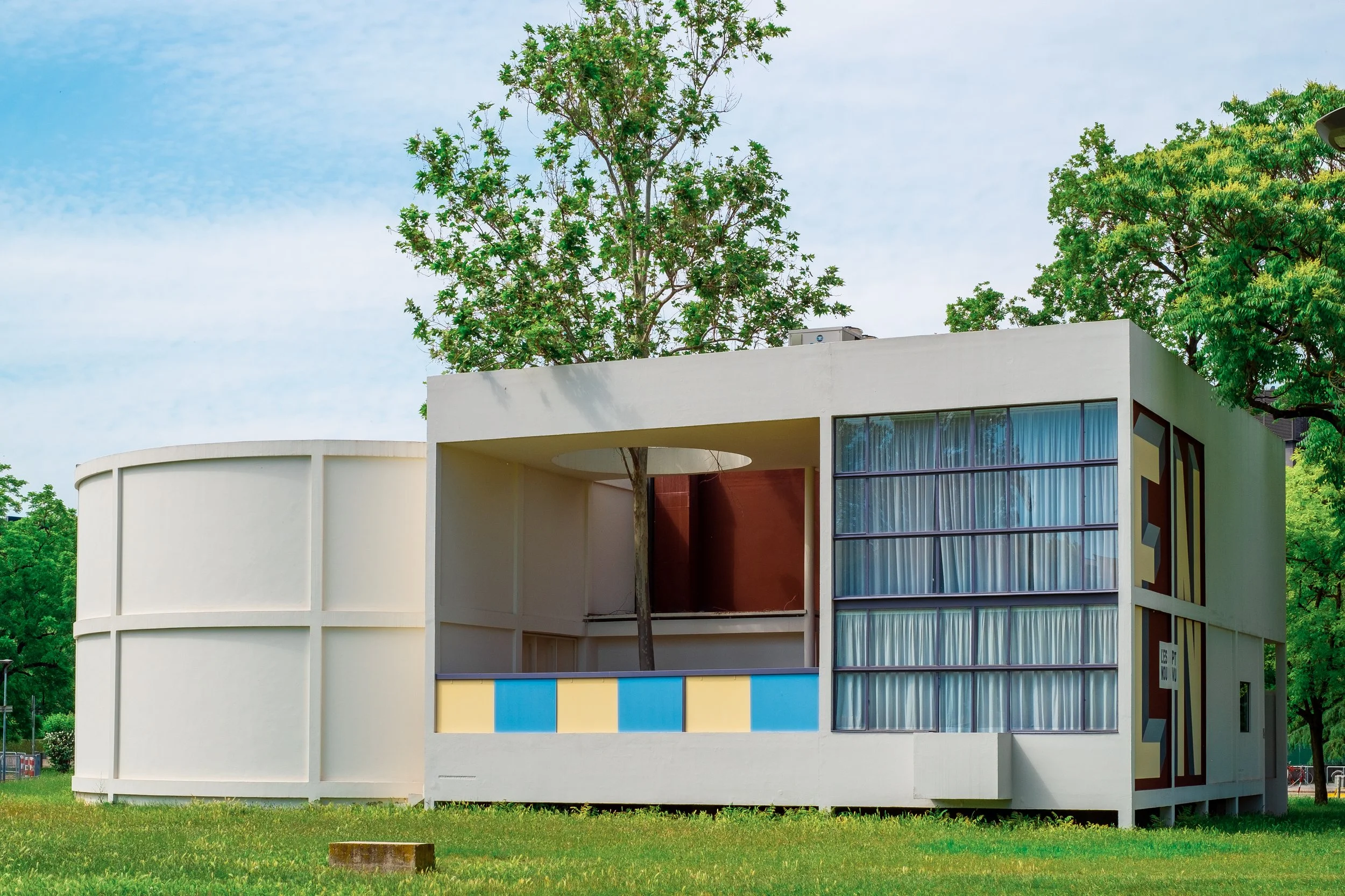
Faithful reproduction of the New Spirit Pavilion – l'Esprit Nouveau, Bologna, Italy, 2021 – an architectural design by Le Corbusier and Pierre Janneret, 1925. Photo © Giorgio Morara – stock.adobe.com
The detrimental effects of badly-designed buildings are well-documented (consider Nicole Sully’s fabulously titled 2009 paper ‘Dear Monsieur Le Corbusier, It is still raining in our garage’) (Sully, 2009). Further, given the many documented cases of ‘sick building syndrome’, where visitors to a specific building present symptoms of illness, such as lethargy, nausea, and headaches due to aerosols released from hazardous elements, flickering lights, and badly-designed or maintained ventilation systems (Conway & Roenisch, 1994), we want to focus on the potential benefits of architectural decisions. In the context of The Sims: can well-designed buildings make individuals happier, healthier, more productive, and creative?
In practice, the basic parameters for ‘healthy’ architecture are essentially the same for humans as they are for any other type of small, terrestrial mammal – you need to ensure that there is sufficient space for movement, sufficient light (ideally natural), and ensure that the environment is not outrageously hot or uncomfortably cold. Corbusier suggested that a house should have an open plan (i.e. no interior load bearing walls that would restrain or dictate its internal use), that houses should make use of horizontal windows that provide even lighting, and that roof gardens should be encouraged. Having said this, the idea of open-plan as utopian is disputed. In Conway and Roenisch’s Understanding Architecture, the index somewhat sarcastically defines open-plan as a project which ‘in theory allowed living space to be organised as the users wished. In practice it meant that it was impossible for various members of a household to pursue different activities in the space without conflict’ (Conway & Roenisch, 1994). Research into the impacts of open-plan in the professional context of offices has confirmed that the net effects of removing all of the walls in an office environment can be enormously negative – reducing productivity, job satisfaction, and straining work relationships (Węziak-Białowolska et al., 2018). Interestingly, research into the inclusion of green spaces and plants in an interior suggests that people are happier, but less productive when surrounded by houseplants, because they are distracted by the plants (Larsen et al., 1998; Nieuwenhuis et al., 2014; Smith et al., 2011). Alas, we are but simple creatures …
Spaces can be deliberately designed to evoke specific emotions: a cathedral might have elaborate vaulted ceilings to lead the eye upward, and inspire a feeling of humility in the visitor (Conway & Roenisch, 1994), while the architecture of a theme park might be designed to instil a sense of calm in visitors while queuing (Ledbetter, 2016). Ultimately, in accordance with The Sims, many thinkers do actually conceive of architecture as a tool for the manipulation of ‘plastic emotions’ (Le Corbusier) and an ‘instrument of affect’ (Ernö Goldfinger).

Notre-Dame Cathedral Basilica, Ottawa, Canada, 2017. Photo: Marc-Olivier Jodoin
Part Three: The Impact of Personality
And so, we arrive at our third and final point of enquiry; can The Sims be considered scientifically accurate given that different Sims (with different personality types) react to architectural choices in different ways? The instinctive answer is yes, different people have different architectural preferences. It’s why Changing Rooms is so compelling, or why Grand Designs can provide such glorious schadenfreude as one watches someone shuffle a sofa into a polished concrete cavern – like a cash-strapped Bond villain. But why is this the case? Are there scientific reasons why certain people prefer certain architectural colours and styles, and if this holds true, could you predict the optimal building for an individual, given a number of known qualities about the person?
We begin by again returning to the topic of colour. It is something of a truism that people have different colour preferences – it’s why companies have the potential to sell hundreds of colours with names like Elephant’s Breath or Beethoven’s Elbow, and not one monolithic product labelled ‘paint’. Broadly speaking, our reception of colour is not purely physiological. There are psychological and culturally-constructed elements at play. To understand this fully, we need to delve into the idea of semiotics: the meanings of signs (Won & Westland, 2017). Semiotics, to provide an immensely concise summary, is predicated upon the idea that a form (sign) has meaning (refers to things that are signified) (D. Chandler, 2002; Kauppinen-Räisänen et al., 2018; Won & Westland, 2017). For example, a shop sign which says ‘open’ (a literal sign) refers to the concept of open-ness; it is signified that a customer can enter, is welcome to browse, and is encouraged to exchange money for merchandise (D. Chandler, 2002). Colours are very effective signs; one may see green and immediately think of nature (Singh & Srivastava, 2011), see grey and think of imminent rain (Won & Westland, 2017), see white and think of purity (Meerum Terwogt & Hoeksma, n.d.), or see purple and think of chocolate (maybe that’s just me?).
Many researchers have investigated whether the connotation of colours are stable between individuals, or whether disaggregating by certain factors (such as age, gender, or cultural heritage) can affect both interpretation and preference (Al-Rasheed, 2015). This realm of research is nothing new – with the first surveys taking place in the early nineteenth century (Al-Rasheed, 2015; A. R. Chandler, 1934). Conclusions in the area are conflicting; while some propose that there are no observable differences in colour preferences between men and women (Camgöz et al., 2002; Child et al., 1968; Ou et al., 2004; Rosenbloom, 2006) others report quantifiable variation (Al-Rasheed, 2015; Ou et al., 2012). For example, in one study “Female observers were found to prefer colour pairs with high‐lightness or low‐chroma values more than their male counterparts” (Ou et al., 2012). Furthermore, experiments into cross-cultural understandings of and preferences for colour have been conducted across a number of different cultures (Madden et al., 2000; Park & Guerin, 2002; Witzel & Gegenfurtner, 2018) These studies suggest that there are both similarities and dissimilarities across different sample groups. For example, when respondents from four countries (Japan, China, South Korea, and the United States) were asked to associate colours with descriptors, all groups of respondents associated the colour blue with the concept of ‘high quality’ and the colour red with the concept of ‘love’ (Madden et al., 2000). In contrast, purple was a point of divergence: respondents from Japan, China, and South Korea associated it with ‘being expensive’, while respondents from the United States associated purple with ‘being inexpensive’ (ibid). The dimension of time can also be considered in the context of individual and cultural response: an avocado bath suite doesn’t have the same connotations in 2020 as it did in 1970. Interestingly, an analysis of Pantone’s ‘colour of the year’ suggests a cyclical pattern of preferences. A quantitative analysis of the colours chosen as ‘the colour of the year’ over time (Gijsenij et al., 2021) concluded that ‘the average Lightness and Chroma [values] (averaged over all companies, per year) appear to follow a wavelike pattern, where the average Lightness appears to repeat itself every ~8 years and the average Chroma approximately every 4.5 years.’ So hang on to your avocado bath suite. It’ll come back around … eventually …
Other researchers have proposed that there may be relationships between personality traits and aesthetic preferences. In a 2012 study, 84 students were asked to take a personality test and then rate pictures of buildings for attractiveness. Cook and Furnham found that 1) neuroticism was positively associated with preferences for Victorian Gothic buildings, 2) extraversion was negatively associated with preferences for Brutalist buildings, and 3) the degree of an individual’s familiarity with a building style was highly predictive of individual preference (Cook & Furnham, 2012). This idea, that the level of familiarity with a building’s style may influence one’s acceptance or affection towards the style, is a key tenet of ‘mere exposure hypothesis’ (Bornstein, 1989; Zajonc, 1968). In essence, the more times an individual is exposed to a stimulus, the more they will begin to like it - sort of like an aesthetic Stockholm Syndrome (Ng, 2020). In other words, it seems to be true that people know what they think they like, and like what they think they know.
Another study expanded upon this idea of personality-contingent aesthetic preferences, to consider whether personality traits correlated with preference for aesthetic styles in a number of different media. Comparing and contrasting the realms of architecture, visual art, and music (Cleridou & Furnham, 2014) it was theorised that introverts prefer lower levels of stimulation in their environment (Ibrahim et al., 2002) and therefore, their evaluation of a building as pleasant or unpleasant may be contingent upon its level of ornamentation and complexity (Janssen & Whiting, 1984). Somewhat self-indulgently, quite a large tranche of work has been devoted to examining whether the characteristic of ‘being an architect’ affects the perception and reception of a building (Ibrahim et al., 2002). Studies have confirmed that architects and non-architects may receive buildings differently – for example, while formally-trained architects may perceive a meaningful distinction between modern and post-modern structures, non-architects may not perceive the two as distinct (Groat, 1982). And while the architectural press may laud a building as ground-breaking, popular opinion might perceive it as broken.
Conclusion
Many aspects of The Sims are actually borne out by scientific research; some architects do envision architecture and design as tools with which to manipulate or augment the emotions of visitors to a building (Corbusier, 1927; Goldfinger, 1941; Warburton, 2004), and it is true that the immanent personality traits of an individual seem to affect their architectural preferences, with cultural heritage and demographic factors also influencing the ways in which architectural decisions are received (Al-Rasheed, 2015; Cook & Furnham, 2012; Gijsenij et al., 2021). The point at which The Sims’ assumptions do not align with real-world data is the field of colour, given that numerous studies have shown that different hues have the potential to induce a wide range of physiological and psychological effects in humans (AL-Ayash et al., 2016; Westland et al., 2017). Although the effects of certain colours such as Baker-Miller pink may be overstated (Genschow et al., 2014), the notion of environmental colour influencing behaviour is an idea that has captured the imaginations of many.
So, to revisit the question posed at the start of this article: if architectural and furnishing choices really influence mood to an observable extent, could one’s living environment be optimized by carefully-considered decor and design? While there are some universal principles to successful buildings – a home shouldn’t be too small, too damp, or on fire – architectural and interior preferences span a broad spectrum, meaning that there is no ‘one size fits all’ approach for interior design or architecture. While the ‘mere exposure hypothesis’ may equate familiarity and acceptance (Ng, 2020), the reception of architectural choices is predicated upon so many variables that it doesn’t seem viable to rely on exposure alone. Accordingly, while it may be tempting to envisage architecture as a tool of emotional manipulation and life-improvement, it’s not quite as simple as developing a unified theory and applying it as a blanket approach. One should consider the field of ergonomics, where products are constructed for some hypothetical average human, resulting in unsuccessful interactions for specific individuals (Peteri, 2017). Accordingly, the pursuit of architecturally-induced happiness is one that must be tailored to the subject, responding to their needs and preferences. Exactly like looking after a Sim, one must respond to the specific needs of an individual rather than the abstract, averaged, aggregated needs of society.

Work area at the Johnson Wax Building, headquarters of the S.C. Johnson and Son Co., Racine, Wisconsin. Color transparency by Carol M. Highsmith, [between 1980 and 2006]
References:
AL-Ayash, A., Kane, R. T., Smith, D., & Green-Armytage, P. (2016). The influence of color on student emotion, heart rate, and performance in learning environments. Color Research and Application, 41(2), 196–205.
Al-Rasheed, A. S. (2015). An experimental study of gender and cultural differences in hue preference. Frontiers in Psychology, 6, 30.
Bornstein, R. F. (1989). Exposure and affect: Overview and meta-analysis of research, 1968–1987. Psychological Bulletin, 106(2), 265–289.
Camgöz, N., Yener, C., & Güvenç, D. (2002). Effects of hue, saturation, and brightness on preference. Color Research and Application, 27(3), 199–207.
Chandler, A. R. (1934). Beauty and human nature, New York, D. Appleton-Century Co. Inc.
Chandler, D. (2002). Chandler, Daniel (2002) Semiotics: The Basics (1st edn). London: Routledge. http://dx.doi.org/
Child, I. L., Hansen, J. A., & Hornbeck, F. W. (1968). Age and sex differences in children’s color preferences. Child Development, 39(1), 237–247.
Cleridou, K., & Furnham, A. (2014). Personality correlates of aesthetic preferences for art, architecture, and music. Empirical Studies of the Arts, 32(2), 231–255.
Conway, H., & Roenisch, R. (1994). Understanding Architecture: An Introduction to Architecture and Architectural History. Psychology Press.
Cook, R., & Furnham, A. (2012). Aesthetic Preferences for Architectural Styles Vary as a Function of Personality. Imagination, Cognition and Personality, 32(2), 103–114.
Corbusier, L. (1927). Vers Une Architecture. Towards a New Architecture ... Translated from the Thirteenth French Edition with an Introduction by Frederick Etchells. John Rodker.
Czeisler, C. A. (2013). Perspective: casting light on sleep deficiency. Nature, 497(7450), S13.
Gaines, K., & Curry, Z. (2011). The Inclusive Classroom: The Effects of Color on Learning and Behavior. https://www.semanticscholar.org/paper/adf583eab0acddd2d536a141c04c10a944a42e08
Genschow, O., Noll, T., Wänke, M., & Gersbach, R. (2014). Does Baker-Miller pink reduce aggression in prison detention cells? A critical empirical examination. Psychology, Crime & Law: PC & L, 21(5), 482–489.
Gijsenij, A., Vazirian, M., Kirchner, E., Spiers, P., Lai, P., Westland, S., & Koeckhoven, P. (2021). Analyzing a decade of colors of the year. Color Research and Application, 46(1), 258–270.
Gilliam, J. E., & Unruh, D. (1988). The effects of Baker-Miller pink on biological, physical and cognitive behaviour. Journal of Orthomolecular Medicine: Official Journal of the Academy of Orthomolecular Medicine, 3(4), 202–206.
Goldfinger, E. (1941). The sensation of space ; Urbanism and spatial order ; The elements of enclosed space. https://www.worldcat.org/title/sensation-of-space-urbanism-and-spatial-order-the-elements-of-enclosed-space/oclc/311776454
Groat, L. (1982). Meaning in post-modern architecture: An examination using the multiple sorting task. Journal of Environmental Psychology, 2(1), 3–22.
Hamid, P. N., & Newport, A. G. (1989). Effect of colour on physical strength and mood in children. Perceptual and Motor Skills, 69(1), 179–185.
Herz, J. C. (2000, February 10). GAME THEORY; The Sims Who Die With the Most Toys Win. The New York Times. https://www.nytimes.com/2000/02/10/technology/game-theory-the-sims-who-die-with-the-most-toys-win.html
Ibrahim, A. F., Abu-Obeid, N., & Al-Simadi, F. (2002). The Effect Of Personality Traits On Architectural Aesthetics’ Evaluation: Familiar And Non-Familiar Environments As Evaluated By Architectural And Non-Architectural Students. Architectural Science Review, 45(3), 197–210.
Janssen, B., & Whiting, H. T. (1984). Sheldon’s physical–psychical typology revisited. Journal of Research in Personality, 18(4), 432–441.
Kauppinen-Räisänen, H., Björk, P., Lönnström, A., & Jauffret, M.-N. (2018). How consumers’ need for uniqueness, self-monitoring, and social identity affect their choices when luxury brands visually shout versus whisper. Journal of Business Research, 84(C), 72–81.
Küller, R., Mikellides, B., & Janssens, J. (2009). Color, Arousal, and Performance-A Comparison of Three Experiments. Color Research and Application, 34(2), 141–152.
Kurt, S., & Osueke, K. K. (2014). The Effects of Color on the Moods of College Students. SAGE Open, 4(1), 2158244014525423.
Kwallek, N. (1996). Office Wall Color: An Assessment of Spaciousness and Preference. Perceptual and Motor Skills, 83(1), 49–50.
Kwallek, N., & Lewis, C. M. (1990). Effects of environmental colour on males and females: A red or white or green office. Applied Ergonomics, 21(4), 275–278.
Kwallek, N., Soon, K., & Lewis, C. M. (2007). Work week productivity, visual complexity, and individual environmental sensitivity in three offices of different color interiors. Color Research and Application, 32(2), 130–143.
Larsen, L., Adams, J., Deal, B., Kweon, B.-S., & Tyler, E. (1998). Plants in the workplace: The effects of plant density on productivity, attitudes, and perceptions. Environment and Behavior, 30(3), 261–281.
Ledbetter, J. L. (2016). INTERACTIVE AMUSEMENT PARK QUEUES: EXAMINING THE INDIRECT EFFECT OF PERCEPTION OF WAIT DURATION THROUGH TASK IMMERSION. University of Central Florida.
Madden, T. J., Hewett, K., & Roth, M. S. (2000). Managing Images in Different Cultures: A Cross-National Study of Color Meanings and Preferences. Journal of International Marketing, 8(4), 90–107.
Meerum Terwogt, M., & Hoeksma, J. B. (n.d.). Colors and emotions: Preferences and combinations. The Journal of General Psychology, 122(1), 5–17.
Ng, C. F. (2020). Perception and evaluation of buildings: The effects of style and frequency of exposure. Collabra. Psychology, 6(1). https://doi.org/10.1525/collabra.324
Nieuwenhuis, M., Knight, C., Postmes, T., & Haslam, S. A. (2014). The relative benefits of green versus lean office space: three field experiments. Journal of Experimental Psychology. Applied, 20(3), 199–214.
Ou, L.-C., Luo, M. R., Woodcock, A., & Wright, A. (2004). A study of colour emotion and colour preference. Part I: Colour emotions for single colours. Color Research and Application, 29(3), 232–240.
Ou, L.-C., Ronnier Luo, M., Sun, P.-L., Hu, N.-C., & Richter, K. (2012). A Cross-Cultural Comparison of Colour Emotion for Two-Colour Combinations. Color Research and Application, 37(1), 23–43.
Park, Y., & Guerin, D. A. (2002). Meaning and preference of interior color palettes among four cultures. Journal of Interior Design, 28(1), 27–39.
Pellegrini, R. J., Schauss, A. G., Kerr, T. J., & Ah You, B. K. (1981). Grip strength and exposure to hue differences in visual stimuli: Is postural status a factor? In Bulletin of the Psychonomic Society (Vol. 17, Issue 1, pp. 27–28). https://doi.org/10.3758/bf03333657
Pellegrini, R. J., Schauss, A. G., & Miller, M. E. (1981). Room color and aggression in A criminal detention holding cell: A test of the “tranquilizing pink” hypothesis. http://orthomolecular.org/library/jom/1981/pdf/1981-v10n03-p174.pdf
Peteri, V. (2017). Bad Enough Ergonomics: A Case Study of an Office Chair. SAGE Open, 7(1), 2158244016685135.
Read, M. A., Sugawara, A. I., & Brandt, J. A. (1999). Impact of Space and Color in the Physical Environment on Preschool Children’s Cooperative Behavior. Environment and Behavior, 31(3), 413–428.
Roberts, V. (2020, February 9). Sims: 20th anniversary - from The Sims to The Sims 4 - a brief history - CBBC Newsround. BBC. https://www.bbc.co.uk/newsround/51266122
Rosenbloom, T. (2006). Color Preference of High and Low Sensation Seekers. Creativity Research Journal, 18(2), 229–235.
Savavibool, N. (2016). The Effects of Colour in Work Environment: A systematic review. Environment-Behaviour Proceedings Journal, 1(4), 262–270.
Schauss, A. G. (1985). The Physiological Effect of Color on the Suppression of Human Aggression: Research on Baker-Miller Pink. 7(2), 55–64.
Singh, N., & Srivastava, S. K. (2011). Impact of Colors on the Psychology of Marketing — A Comprehensive over View. Management and Labour Studies, 36(2), 199–209.
Smith, A., Tucker, M., & Pitt, M. (2011). Healthy, productive workplaces: Towards a case for interior plantscaping. Facilities, 29(5/6), 209–223.
Snyder, M. L. (1981). A nursing study on the effect of environmental color on behavior. Behavioral Ecology: Official Journal of the International Society for Behavioral Ecology, 2, 1–8.
Sully, N. (2009). Modern Architecture and Complaints about the Weather, or,“Dear Monsieur Le Corbusier, It is still raining in our garage….” M/C Journal, 12(4). http://www.journal.media-culture.org.au/index.php/mcjournal/article/view/172
Vandewalle, G., Collignon, O., Hull, J. T., Daneault, V., Albouy, G., Lepore, F., Phillips, C., Doyon, J., Czeisler, C. A., Dumont, M., Lockley, S. W., & Carrier, J. (2013). Blue light stimulates cognitive brain activity in visually blind individuals. Journal of Cognitive Neuroscience, 25(12), 2072–2085.
Wang, H., & Russ, R. R. (2008). Computer classroom wall colour preference and the. Colour: Design & Creativity. https://aic-color.org/resources/Documents/jaic_v2_03.pdf
Warburton, N. (2004). Ernö Goldfinger: The Life of an Architect. Routledge.
Westland, S., Pan, Q., & Lee, S. (2017). A review of the effect of colour and light on non-image function in humans. Coloration Technology, 133(5). https://doi.org/10.1111/cote.12289
Węziak-Białowolska, D., Dong, Z., & McNeely, E. (2018). Turning the Mirror on the Architects: A Study of the Open-Plan Office and Work Behaviors at an Architectural Company. Frontiers in Psychology, 9, 2178.
Witzel, C., & Gegenfurtner, K. R. (2018). Color Perception: Objects, Constancy, and Categories. Annual Review of Vision Science, 4, 475–499.
Won, S., & Westland, S. (2017). Colour meaning and context. Color Research and Application, 42(4), 450–459.
Zajonc, R. B. (1968). Attitudinal effects of mere exposure. Journal of Personality and Social Psychology, 9(2p2), 1–27.